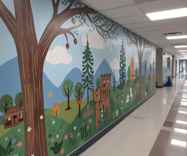
<p>Use balanced palettes that match the activity. Calming greens and soft blues suit libraries and counselling rooms. Warm neutrals with one bright accent can energise activity zones without overwhelming pupils. In classrooms, maintain a clear contrast near the board so notes remain readable. Test sample swatches on the actual wall and observe them at different times of day before finalising.</p>
FAQ Image

Question
What colour shades are best for educational premises?
