In colour psychology, hues are much more than a visual treat. They have a significant impact on our emotions and perceptions. They can affect our mood, behaviour, and decision-making processes without us even knowing it.
Whether it's selecting the best colour for your living room or even wearing an outfit, the colours around you are silently influencing your decisions. In this post, we will look at various hues found on the colour psychology chart and how their understanding can help you make better choices in varied spaces.
What Is Colour Psychology?
Colour psychology is an area of study that looks at how colours may impact our feelings, behaviour, and decision-making. It implies that colours aren't just visual triggers, but that they have more impact at a deeper level of our subconscious minds. Each colour evokes certain emotions and induces varied psychological reactions.
For instance, red is frequently associated with energy, passion, and urgency. Similarly, blue is associated with relaxation, trust, and stability. That’s why understanding the psychology of colour can allow us to make more conscious decisions in anything from creating brand logos to designing our homes. The point is that colours have a meaning beyond their looks, and understanding those associations can help us interact with the world in a better way.
The Colour Wheel And Its Segments
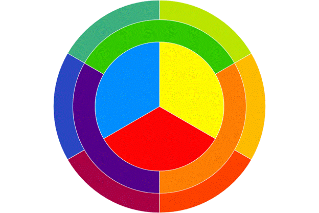
The colour wheel is a fundamental tool for understanding the meaning of different shades. It serves as the foundation of colour theory and psychology. It consists of the following:
Colour Type | Examples | Description |
Primary Colours | Red Blue Yellow | They are standalone shades. |
Secondary Colours | Green Purple Orange | They are created by mixing primary colours. |
Tertiary Colours | Yellow Green Red Orange Yellow Orange Blue Green Blue purple Red Purple | They are created by combining primary and secondary hues. |
The way these colours interact on the wheel can influence psychological responses. Complementary colours evoke contrast and harmony, while analogous colours create calm and unity.
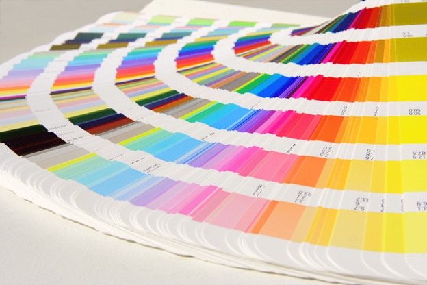
Understand Colour Psychology Chart And Hues
The colour psychology chart reveals that every colour has emotional weight and cultural meaning. Colours, from the warm and energising to the cool and calming, have a subtle influence on the way we think and behave. Here are some more details on the link between colour and psychology.
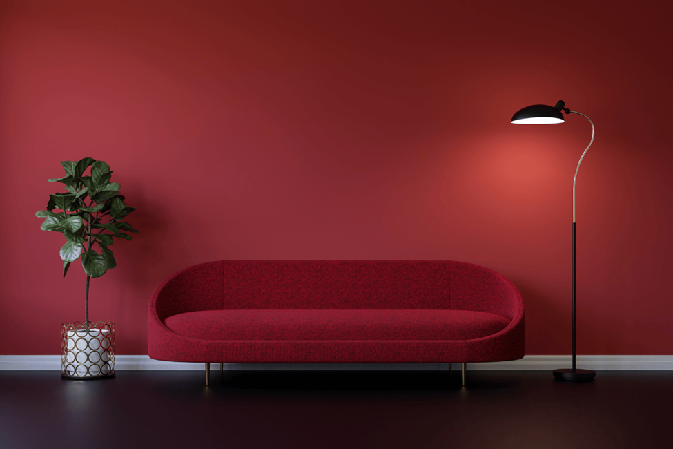
Red: The Colour Of Energy And Passion
Red instantly stimulates the senses with its element of high energy and passion. It is also attributed to bravery and action. The shade is a marketing favourite that stands out from the crowd. But at the same time, red can also trigger negative emotions, including aggression, danger, and anger. In branding, companies like Coca-Cola use the hue to portray a sense of high energy. In art, it’s used to denote intense feelings. Red is frequently used in fashion to convey boldness and confidence.
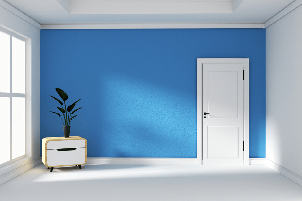
Blue: The Colour Of Trust And Reliability
What does blue colour mean in psychology? It symbolises stability and tranquillity and is often described as peaceful and intelligent. Blue colour in psychology also emphasises trustworthiness and professionalism in the business world. On the other hand, blue can also be interpreted as cold or even sad. Blue is a standard colour in nature, found in the sky and oceans, reinforcing its calming effect. IBM and Facebook use blue to build trust and loyalty with their audiences.
Yellow: The Colour Of Joy And Optimism
Yellow is the colour of happiness, positivity, and creativity. It generates feelings of warmth and happiness and is said to be the most common colour used in marketing to gain the customer’s attention and promote clear thinking. But too much of it can make you anxious or look cheap. Brands like McDonald's use yellow to create a friendly and inviting atmosphere. Yellow accents are often used in design to invoke energy and cheerfulness.
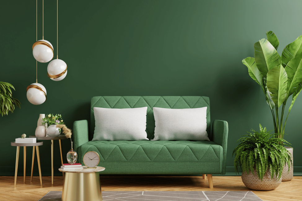
Green: The Colour Of Nature And Growth
Green is often linked to natural beauty and good health. It also conveys stability and rejuvenation, so it’s a popular choice for eco-friendly branding. On the downside, green also represents envy. In medicine, it represents healing, so it is often used in hospitals and wellness brand logos. Green is also important in sustainability initiatives as it represents awareness of the environment.
Orange: The Colour Of Enthusiasm And Creativity
Orange sparks enthusiasm, imagination, and warmth, so it promotes feelings of success and excitement. It is commonly used in marketing to project energy and innovation. But orange can also come across as immature or cheap. Brands like Fanta or Home Depot use orange to convey power and enthusiasm. In the world of art, the orange colour effect on mood is liveliness.
Purple: The Colour Of Luxury And Wisdom
For centuries, purple has been the colour of royalty and wit. It communicates spirituality and depth and is often used to stimulate sophistication. On the negative side, purple can occasionally signify mystery or even gloom. Historically, purple was worn by elites, and today, companies like Yahoo and Hallmark use it to signify prestige and wealth. It is also associated with creative and spiritual endeavours.
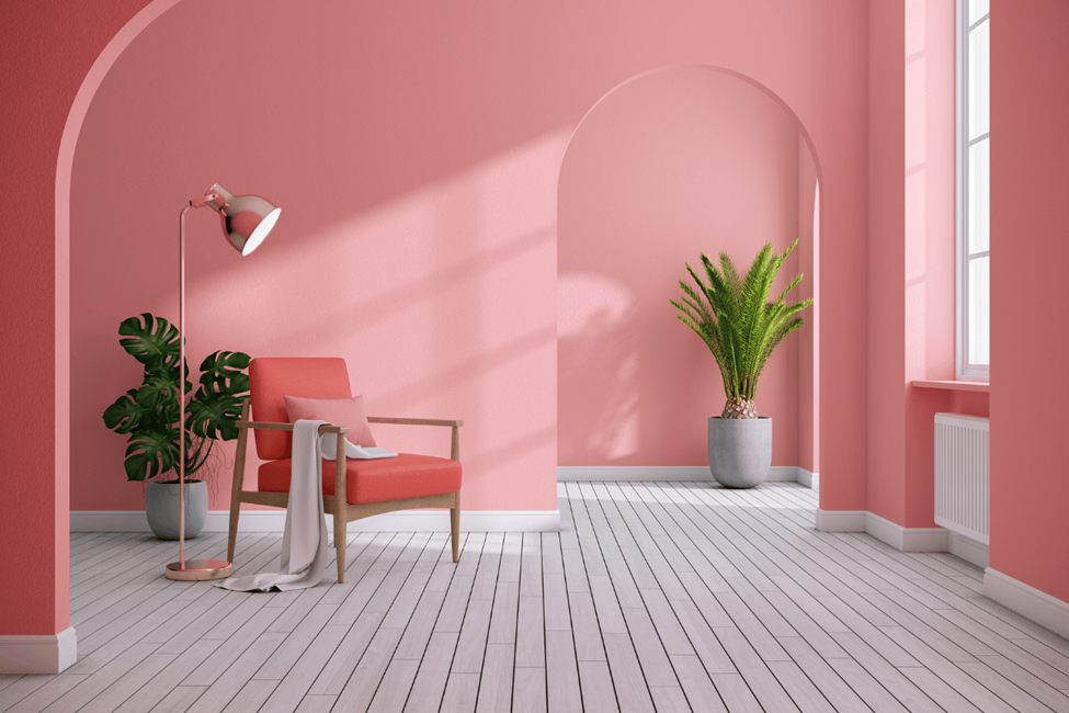
Pink: The Colour Of Softness And Compassion
Pink is often associated with femininity, love, and affection. It represents empathy and tenderness. It brings a sense of calm and compassion. But the shade might also convey passivity and a lack of seriousness. Pink is often used in marketing to women, especially in the beauty and cosmetics industry. Brands such as Victoria’s Secret and Barbie adopt it to tap into softness and love, yet it’s also used in charity campaigns that support breast cancer awareness, which also supports its compassionate characteristics.
Brown: The Colour Of Earth And Reliability
Brown represents a sense of earthiness and warmth. It is associated with reliability and groundedness. But the negative connotations of brown are decay, poverty, and dullness. Companies, including UPS and Hershey’s, employ brown in branding to evoke trust and authenticity. In design, it helps to create a natural, organic feeling. It is often used in eco-friendly packaging or earthy interior design to convey trust and reliability.
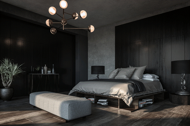
Black: The Colour Of Power And Sophistication
Black stands for elegance, sophistication, and power. Depending on the context, it can even be evocative of mystery or mourning. But this colour is often associated with all things negative, including death and evil. The black colour psychology is used by luxury brands such as Chanel and Gucci to convey the exclusivity and premium quality of their products. When it comes to design, black is a radical expression of style that is full of strength and power.
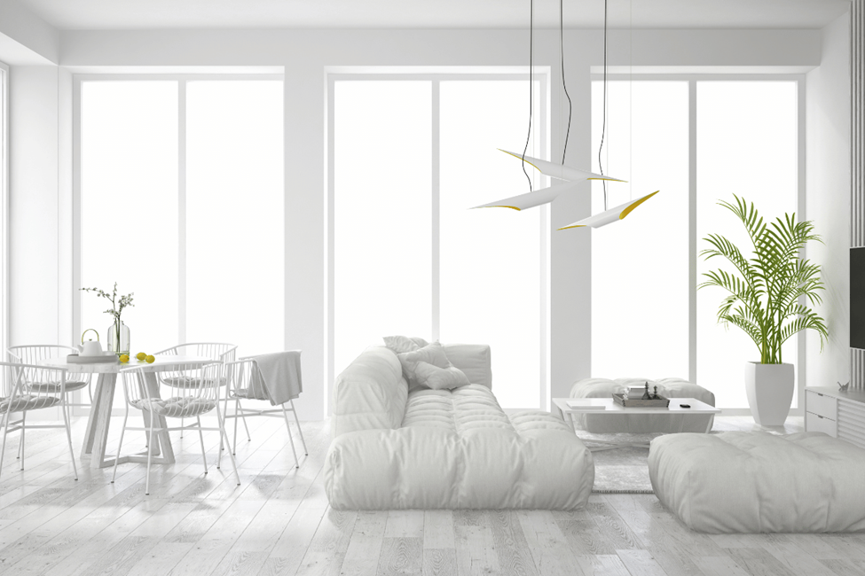
White: The Colour Of Purity And Cleanliness
White is known as the colour of peace and innocence. It indicates purity and simplicity. White is often seen in hospitals and medical establishments. Nothing transmits cleanliness better and is one of the most soothing colours. But its negative meanings include isolation and emptiness. In fashion, white is symbolic of freshness and starting over, like in white wedding dresses. It is also popular in contemporary interior design to create spaces free of clutter.
Grey: The Colour Of Neutrality And Balance
Grey is associated with sophistication and professionalism. As much as grey suggests stability, it sometimes comes across as indecisive or boring. When it comes to design and technology, grey is a colour that is often used to give things a compact and modern look. It is so low-key and discreet that it serves as the background to other colours, without overpowering the senses.
Colour Psychology In Rooms And Interior Designs
The colours we select for the inside of our homes can influence how we feel and behave. Colour psychology for rooms helps us to match our environment to our emotional and practical requirements, so that our spaces are conducive to our lifestyles.
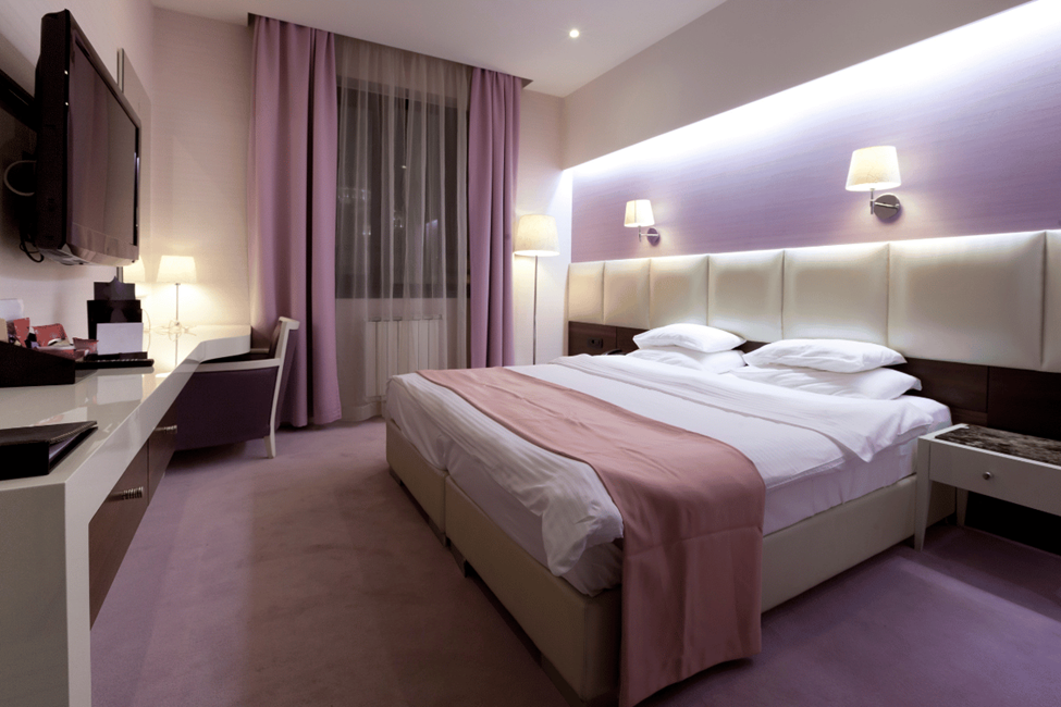
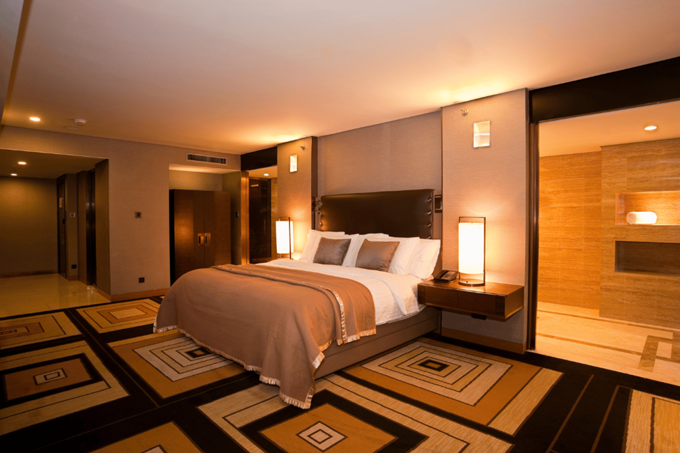
Colours For Bedrooms
Bedroom colour psychology suggests that soothing shades help to relax and wind down your brain for a restful night’s sleep. Soft blues inspire calm and serene vibes, and gentle greens feel calm and natural. The best calming colours for bedroom according to psychology chart also include subdued neutrals such as beige, muted grey, and off-white. These calm colours reduce anxiety and provide a break from the stress of the day.
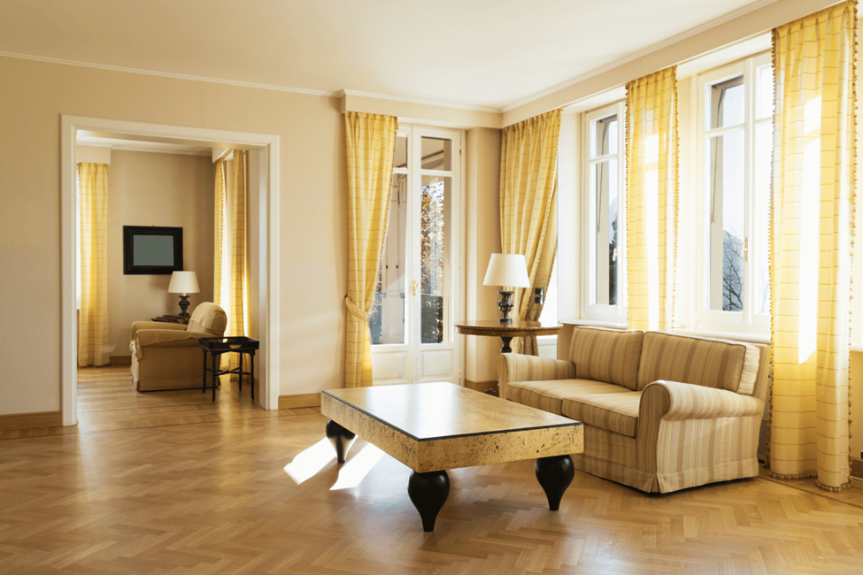
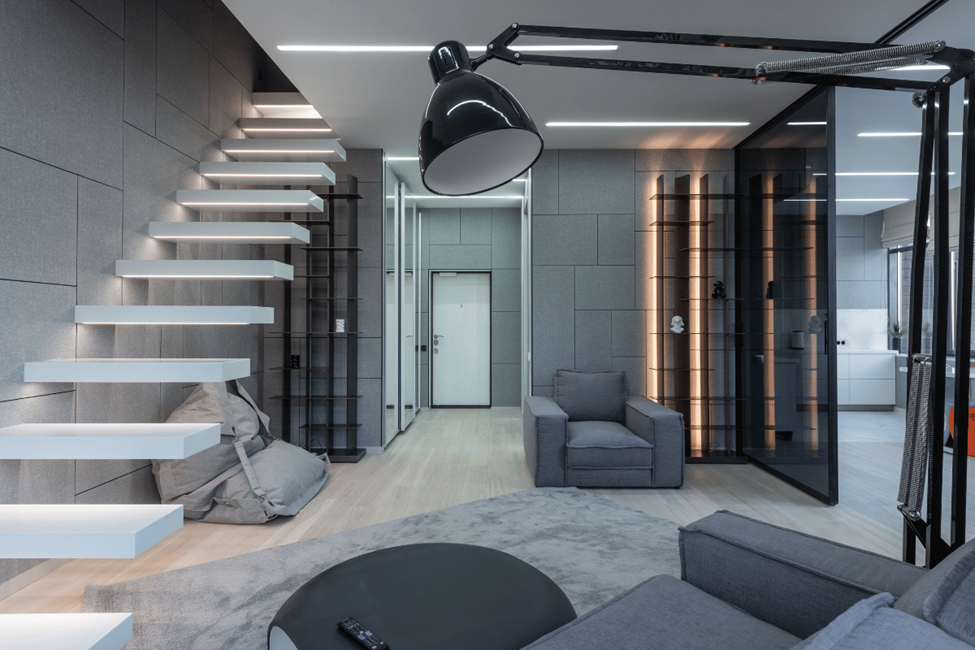
Colours For Living Rooms
Colours that promote warmth, sociability and relaxation are the lifeblood of living rooms. Warm neutrals like tan and creamy whites establish a cosy foundation, with pops of yellow and burnt orange adding zesty energy without taking over the room. Such colours are conducive to the friendly spirit of the room, allowing people to communicate with one another while being entertained or spending quality time with the family in a comfortable, laid-back environment.
Colour Choices For Kitchens And Dining Rooms
Kitchen and dining areas should have colours that inspire appetite and energy. Red, orange, and yellow are said to stimulate the appetite and create excitement. They can bring life to a space without overwhelming it. Bring a little warmth, bustle, and friendliness to meals with these bright shades.
Colours For Home Offices
Cooler colours that encourage focus and productivity work best for home offices. Soft blues and cool greens keep you focused. Certain greys, especially those with blue or green in them, can help give a space a contemporary and uncluttered vibe. These colours increase mental clarity and decrease visual distractions and are excellent for working or studying from home.
Conclusion: How To Use A Colour Psychology Chart Effectively
When we are aware of colour psychology, we have the freedom to design spaces that fit our lifestyles and emotions. If you are using a colour psychology chart, you can opt for colours that improve mood or calm the brain. From soothing blues for bedrooms to stimulating reds for kitchens, soulful colour choices can reimagine interiors as harmonious spaces.