Warm, comforting, and effortlessly stylish, coffee-inspired shades, from deep espresso to soft latte and creamy mocha, are set to shape Autumn home décor. A well-planned coffee colour palette adds cosy sophistication to living rooms, kitchens, bedrooms, and even exterior walls, blending timeless elegance with on-trend seasonal warmth. If you have been searching for coffee brown house colour ideas or coffee colour for wall inspiration, this guide will help you build a scheme that feels grounded and welcoming.
Why Choose A Coffee Colour Palette This Autumn
Designers are stepping away from cool greys and complex whites and leaning into grounded, biophilic tones that feel close to nature and kinder to daily life. Coffee colours do this beautifully. They sit in that sweet spot: calm and neutral on one hand, rich and intentional on the other. They create a sense of well-being in busy homes and pair easily with both existing furniture and fresh accents. What you gain:
- Versatility: Coffee tones work in modern, farmhouse, Scandinavian, and transitional interiors without feeling forced.
- Staying power: Neutrals with character. The palette will look current next year and classic five years later.
- Emotional warmth: The hues echo everyday rituals, your morning brew, a cosy café, so rooms feel relaxed, not staged.
Benefits Of Coffee-Inspired Shades
- Warm and welcoming: A natural choice for a homely feel.
- Easy to coordinate: Pairs with light, dark, and metallic accents.
- Timeless style: Looks refined in modern, rustic, or traditional schemes.
- Mood-enhancing: Creates a calm, grounded atmosphere that softens hard edges.
Coffee Colour Combinations For Autumn Season
Below are eight colour theory-led pairings that bring out the best in coffee tones. Use them as starting points, then tweak depth and proportion to suit your light and layout.
1. Coffee Brown And Cream White
A timeless pairing that balances richness and freshness.
- Works well for: Living rooms, hallways, and exteriors.
- Creates: A cosy yet bright atmosphere with gentle contrast.
- Tip: Cream on large surfaces; coffee brown on furniture, frames, or a single feature wall.
2. Mocha Brown And Warm Beige
Soft and sophisticated with a layered, enveloping look.
- Works well for: Bedrooms, kitchens, and lounges.
- Creates: Subtle depth and a serene finish.
- Tip: Choose tactile textiles, linen, boucle, or velvet to keep the palette feeling plush.
3. Caramel And Off-White
Warm and airy, ideal for compact rooms that need lift.
- Works well for: Kitchens and entryways.
- Creates: A cheerful, inviting tone that bounces light around.
- Tip: Combine off-white counters with caramel cabinetry for a fresh, sunlit feel.
4. Dark Roast And Taupe
Grounded and earthy with a smart, autumnal soul.
- Works well for: Dining rooms, studies, and rustic exteriors.
- Creates: A rich, nature-inspired ambience.
- Tip: Bring in matte black metal or smoked wood to sharpen the edges.
5. Latte Beige And Olive Green
Organic and calming; a nod to woodland shades.
- Works well for: Living rooms and garden-facing areas.
- Creates: A balanced, biophilic scheme.
- Tip: Add plants and woven storage to amplify the green notes.
6. Coffee Brown And Gold
Quiet luxury when used with restraint.
- Works well for: Living rooms, dining areas, and façades with detailing.
- Creates: A regal, modern charm.
- Tip: Use gold in small moments, lighting, mirror frames, or door hardware.
7. Soft Latte And Charcoal
Elegant and balanced, perfect for minimal spaces.
- Works well for: Kitchens and feature walls.
- Creates: Understated sophistication without feeling cold.
- Tip: Keep lines clean and let texture, stone, timber, wool, do the talking.
8. Cocoa And Warm White
Gentle and cosy with a restful quality.
- Works well for: Bedrooms and compact lounges.
Creates: Peaceful energy that never overwhelms.
Tip: Layer knitted throws and soft rugs to deepen the comfort.
How Coffee Colours Transform Different Parts of the House
Below you will find practical, room-by-room guidance. Use it to plan coffee colour bedroom ideas, a refined coffee colour kitchen, or even a coffee colour bathroom refresh.
Bedroom Coffee Colour Combinations
- Cocoa And Warm White
Creates a calm, restful environment.
Style tip: Choose linen or cotton to soften the edges. Add warm wood bedside tables for balance.
- Espresso And Beige
A luxurious, hotel-inspired pairing that feels smart yet cosy.
Style tip: Paint the wall behind the headboard in espresso and keep bedding, curtains, and rugs in beige.
- Dark Roast And Taupe
Rich and grounding, perfect for moody bedrooms.
Style tip: Layer soft amber lighting and brass pulls to highlight the darker tones.
Extra ideas: If you are updating coffee colour bedroom furniture, consider matte walnut or dark oak. For coffee colour bedroom walls, keep ceilings and trims lighter so the room does not feel boxed in.
Living Room Coffee Colour Combinations
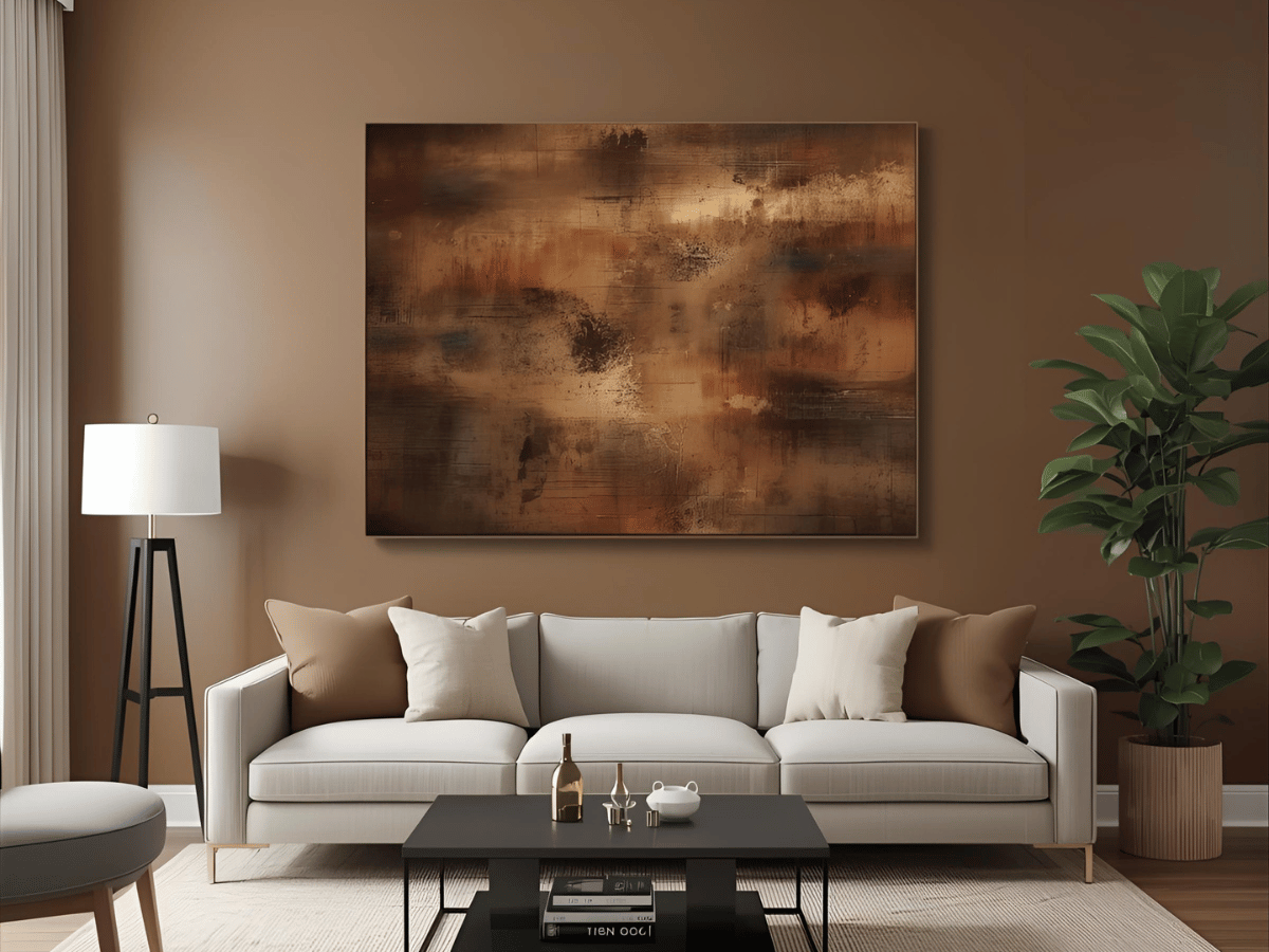
- Coffee Brown And Cream White
A classic mix living room inspiration that brings warmth and balance.
Style tip: Use cream on the main walls and deep coffee on a bookcase, console, or accent chair.
- Mocha And Warm Beige
Great for a conversational, welcoming space.
Style tip: Try a mocha accent wall with beige sofas, then add black side tables to steady the palette.
- Cappuccino And Charcoal Grey
Sleek and modern with a clear visual rhythm.
Style tip: Glass décor or bronze lighting will add sparkle.
- Latte And Olive Green
Earthy and natural, ideal for a relaxed mood.
Style tip: Pair latte walls with olive cushions and planters.
Note: If you are planning a coffee brown living room, keep a mix of soft and firm textures, wool, leather, and oak, so the space feels layered, not flat.
Kitchen Coffee Colour Combinations
- Latte Beige And White
Bright and fresh—great for small or minimal kitchens.
Style tip: White cabinets with latte splashback or wall paint keep things crisp.
- Cappuccino And Brass Accents
Warm yet contemporary.
Style tip: Brass handles, pendants, and a simple tap elevate the whole room.
- Mocha And Terracotta
Rich and autumnal with plenty of character.
Style tip: Terracotta tiles or accessories add depth without stealing focus.
- Caramel And Off-White
Airy and light, perfect for busy kitchens.
Style tip: Caramel walls with off-white counters or tiles give a clean, friendly finish.
If “coffee colour kitchen” ideas are on your list, keep task lighting bright and under-cabinet to avoid shadows on your worktops.
Hallways And Entrances
- Walls: Cappuccino or creamy mocha.
- Doors and Frames: Espresso or dark roast for contrast.
- Lighting: Golden or amber tones for an elegant glow.
- Practical note: Consider durable bedroom coffee colour paint finishes (wipes clean) for high-traffic areas too.
Exterior Wall Coffee Colour Combinations
- Espresso And Ivory
Bold and timeless for modern façades.
Style tip: Espresso on the main wall with ivory trims and window frames.
- Mocha Brown And Stone Grey
Balanced and earthy.
Style tip: Pair with timber or stone cladding for texture.
- Dark Coffee And Off-White
Elegant and welcoming, ideal for family homes.
Style tip: Off-white pillars or borders beautifully frame the deeper base.
- Coffee Brown And Gold
Subtle luxury in the small details.
Style tip: Use gold on door handles, light fittings, and the nameplate only; restraint keeps it tasteful.
If you are choosing coffee colour paint on house exteriors, sample in full daylight before committing. Sunlight can lift undertones more than indoor lamps.
Quick Planning Notes
Here are the key things to consider:
- For bedroom coffee colour schemes, switch to warmer bulbs; blue light can make browns look dull.
- For coffee colour for wall projects, paint a large A3 swatch on different walls and watch it for a full day.
- For bathrooms, keep tiles light and introduce coffee tones through vanity fronts and accessories. It keeps a coffee colour bathroom fresh rather than heavy.
- If you are comparing coffee brown matching colours, look for whites with a creamy base, greens with a hint of olive, and greys that lean taupe rather than blue.
Conclusion
The coffee colour palette adds warmth, elegance, and lasting charm to every part of your home, from cosy living rooms to smart kitchens and sophisticated exteriors. If you want a precise, professional finish with less mess and downtime, Berger Express Painting offers expert colour guidance, advanced tools, and flawless results. It is a faster, cleaner route to a coffee-inspired home that feels just right for Autumn 2025.